← all work · case study — EPIC innovation challenge · 2026

Dreamaker

Dreamaker is an AI-powered personal growth platform — it helps people gain clarity, act on meaningful goals, and find a supportive community. I redesigned its onboarding from scratch, so arriving feels like being guided by a companion, not interrogated by a form.

Client work under NDA — visuals are my own process artifacts and redrawn wireframes.

OPENS YOUR WORDS GUIDED BY SIDEKICK ONE FIRST STEP Q · 01 What do you keep dreaming about? IN YOUR OWN WORDS meets you where you are SIDEKICK asks, never interrogates SIDEKICK keeps it human SIDEKICK YOU CHOOSE ONE start small

fig_01 — the arrival, redrawn as a conversation

Client
Dreamaker
Kind of work
UX research, testing & onboarding redesign
Timeline
2026 · EPIC Innovation Challenge
Where it landed
V1 → V2 tested · V3 in progress
01 the challenge 02 listening 03 the design 04 what changed
what I independently built & led
onboarding redesign · V1 & V2 user testing & recruiting feedback analysis survey development screen inventory & product mapping
01 — the challenge

People arrived excited and left confused.

People came to Dreamaker with something they cared about — a goal, a change, a dream. But onboarding asked for goals, categories, and timelines up front, interrogating people before it ever guided them. The brief I set myself: make the first screens calm and supportive, and position the Sidekick as a companion, not a productivity coach.
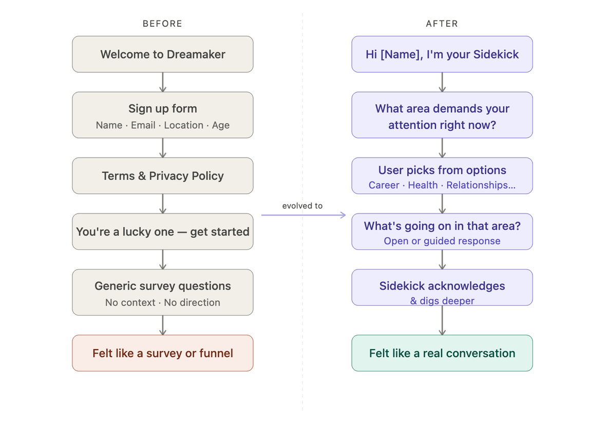
Before-and-after onboarding flow. Before: a welcome, a sign-up form for name, email, location and age, terms, a generic 'you're a lucky one' screen, and generic survey questions — it felt like a survey or funnel. After: the Sidekick greets you by name, asks what area needs your attention, you pick from options such as career, health or relationships, describe what's going on, and the Sidekick acknowledges and digs deeper — it felt like a real conversation.
fig_02 — the old sign-up, redrawn as a Sidekick-led conversation
02 — user testing

I tested V1 with 13 real people.

Once I had a working prototype, I recruited and ran sessions with thirteen participants, ages 19 to 62 — teachers, students, designers, healthcare and business professionals, and people in tech. Everything below comes from testing my own onboarding prototype, not the current Dreamaker app.
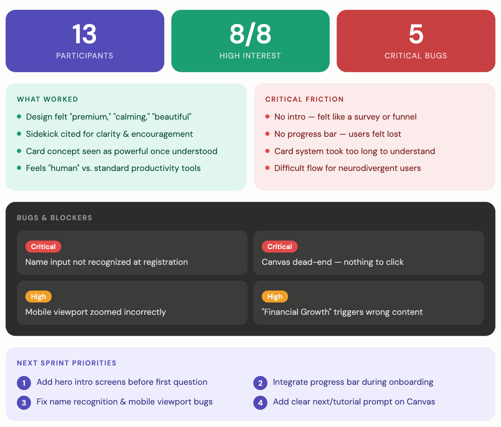
V1 test readout. Top line: 13 participants, 8 of 8 high interest, 5 critical bugs. What worked: design felt premium, calming and beautiful; the Sidekick was cited for clarity and encouragement; the card concept was powerful once understood; it felt human versus standard productivity tools. Critical friction: no intro so it felt like a survey, no progress bar so users felt lost, the card system took too long to understand, and the flow was difficult for neurodivergent users. Bugs and blockers were logged, and next-sprint priorities set: add hero intro screens, integrate a progress bar during onboarding, fix name recognition and the mobile viewport, and add a clear next prompt.
fig_03 — V1 test readout: what worked, what broke, what came next

"It feels more like a guided experience than a typical productivity app."

what they liked

"I would use it right away."

what they liked

"I need to understand the context and purpose of the app."

what they needed

"A progress bar would be good — I didn't know how much was left."

what they needed
→ how I ran it, if you like process

Alongside the onboarding work I built a structured feedback system for the broader app test: I reviewed the MARS quality framework, built a Google Forms survey and a branded Netlify version, and set up response collection and CSV-export workflows so findings were easy to analyze and share.

03 — the redesign

V2: onboarding as a conversation, not a form.

Testing V1 made one thing clear — onboarding needed to feel like a conversation. V2 added context and intro screens, replaced generic questions with a Sidekick-guided exchange, and introduced a progress bar so people always knew where they stood. The wireframes below are my own redraws — boxes and lines, no client branding.
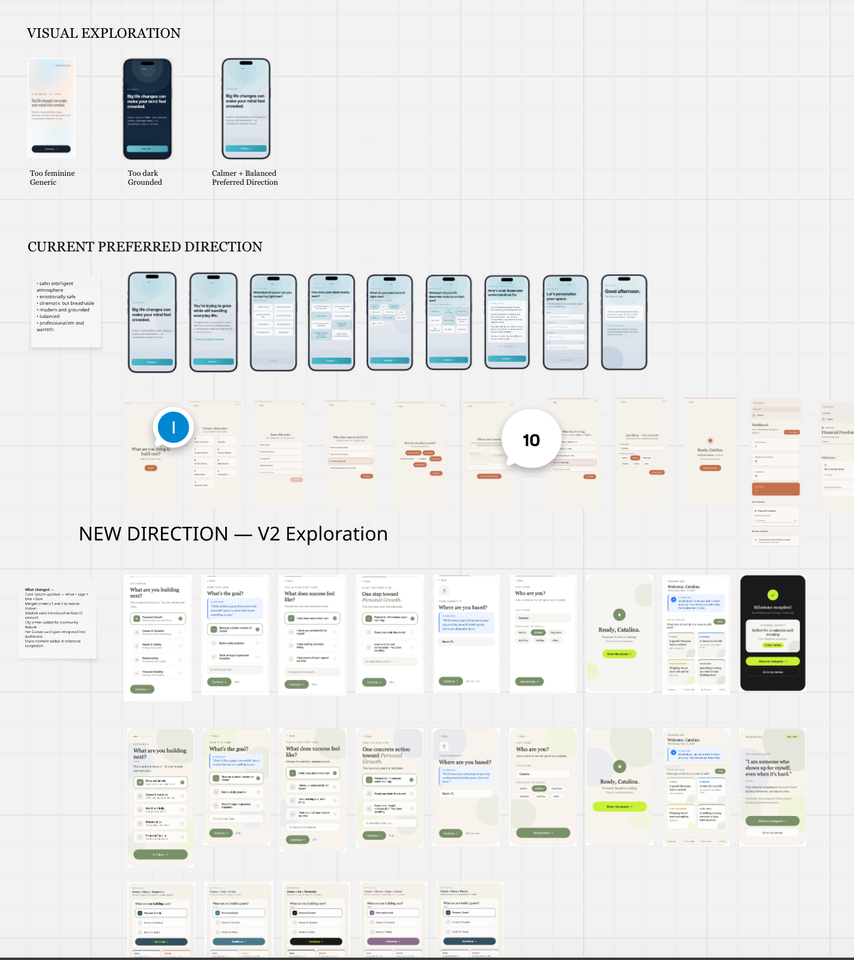
My design-exploration board: an early visual-exploration row (labelled too feminine, too dark, and a calmer balanced preferred direction), then the current preferred direction as a row of screens, then the V2 exploration adding context screens, a Sidekick-guided conversation, and a progress bar.
fig_04 — visual exploration → preferred direction → V2
1 / 5
01 · context & a warm welcome
2 / 5 — YOUR WORDS
02 · Sidekick-guided conversation
5 / 5
03 · progress + one first step
→ the longer version, if you like process

V1 to V2 across two rounds. The biggest shift was less interrogation and more guidance — letting the Sidekick lead — plus a visible progress bar, the single most-requested change from testers.

"It feels personal, reflective, and human in a way that most productivity apps don't."

— participant · V1 testing
04 — what changed

From a prototype to a plan for beta.

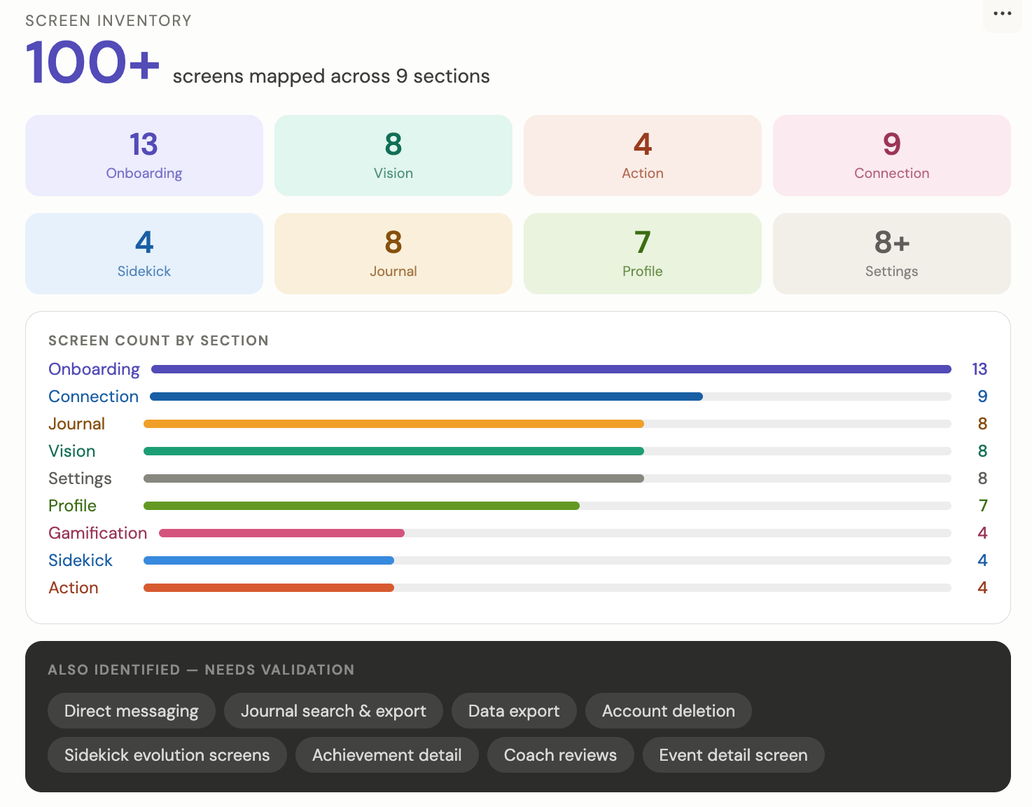
100+ screens mapped for beta
9 sections, onboarding to settings
V3 onboarding now in progress
Screen inventory: 100+ screens mapped across 9 sections — Onboarding 13, Vision 8, Action 4, Connection 9, Sidekick 4, Journal 8, Profile 7, Settings 8+ — with a screen-count bar chart and a list of areas still needing validation.
fig_05 — screen inventory & product map for beta
  • Strong results led to me mapping the full app — Onboarding, Vision, Action, Connection, Profile, Sidekick, and Settings — for beta.
  • The Sidekick-guided conversation and progress model carried into V3, now in progress ahead of beta launch.
  • Biggest lesson: good onboarding is about creating understanding, not just collecting information — and real users catch what designers and founders overlook.
explore another project

○ Client work under NDA — visuals are my own process artifacts and redrawn wireframes.

Have an idea like this one?

→ tell me about it