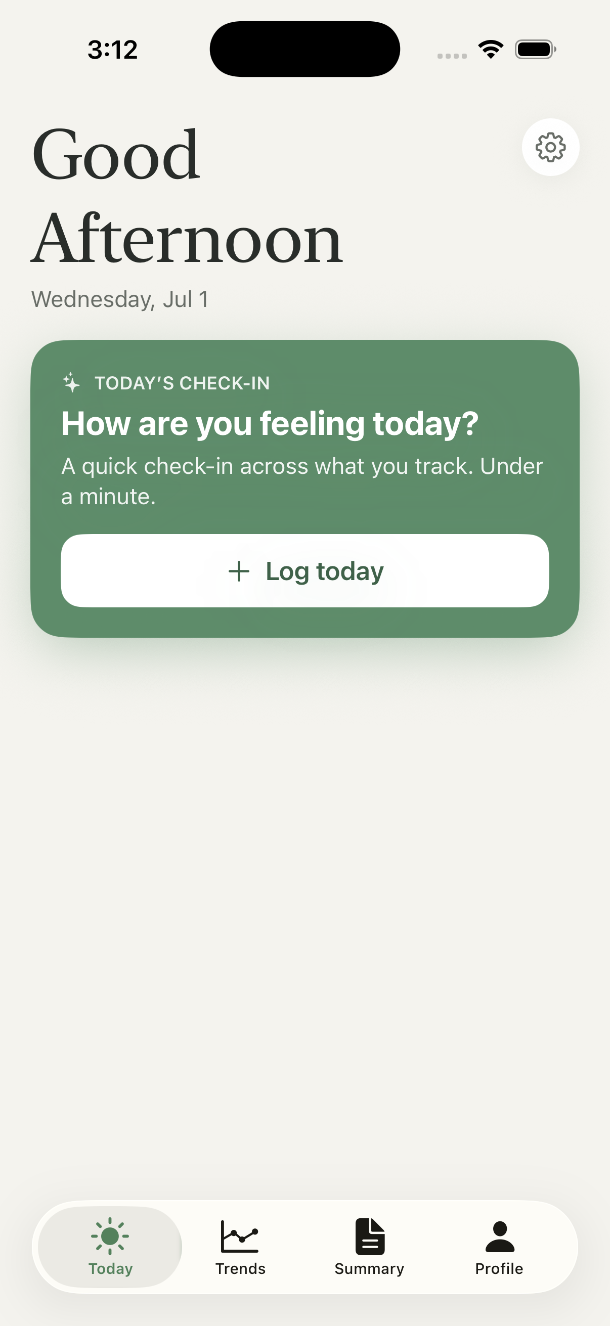
Health tracking shouldn't feel like homework.
A flare-up here, a bad night's sleep there, a food that didn't sit right — the moments that matter end up scattered across mood, energy, and guesswork. By the time you're sitting in front of a doctor, the details are gone.
Most tracking apps answer this with dashboards, streaks, and red warning badges — turning gentle noticing into one more thing to keep up with, and quietly making people anxious about their own bodies.
- 01signals scattered across mood, sleep, energy, and meds
- 02patterns you only notice once they're a problem
- 03the details forgotten by the time they matter
- 04tools that feel clinical, cold, and a little alarming
- 05turning daily noticing into something actually useful
Design and build, end to end.
Signals is a studio project, so I owned the whole arc — from the first user conversations to the shipped TestFlight build.
From a question to a shipped build.
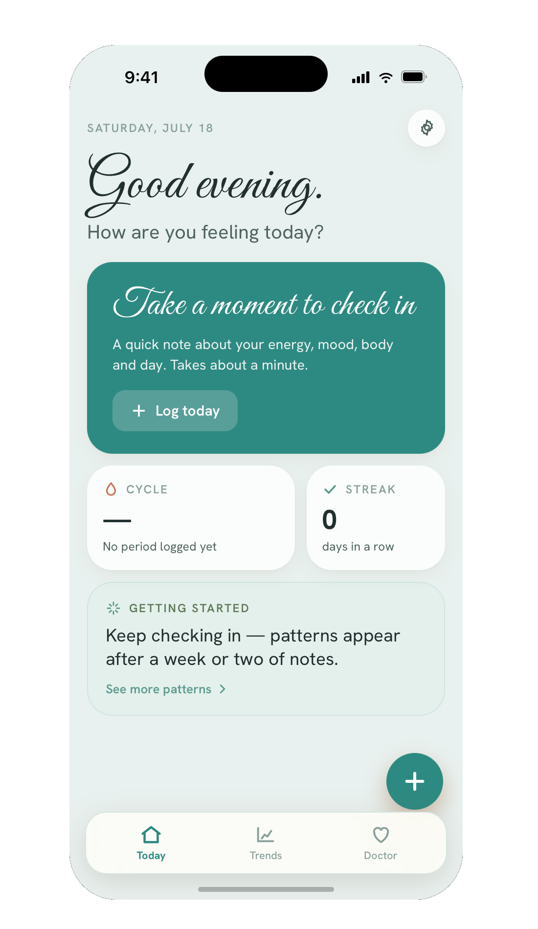
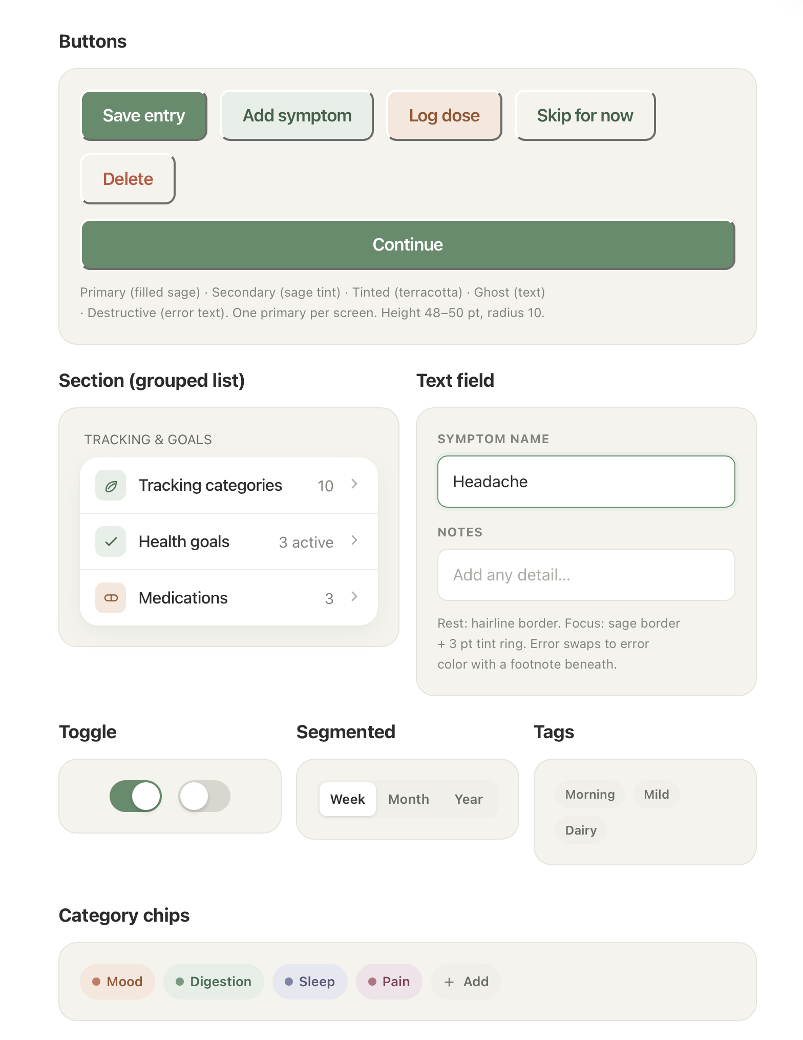
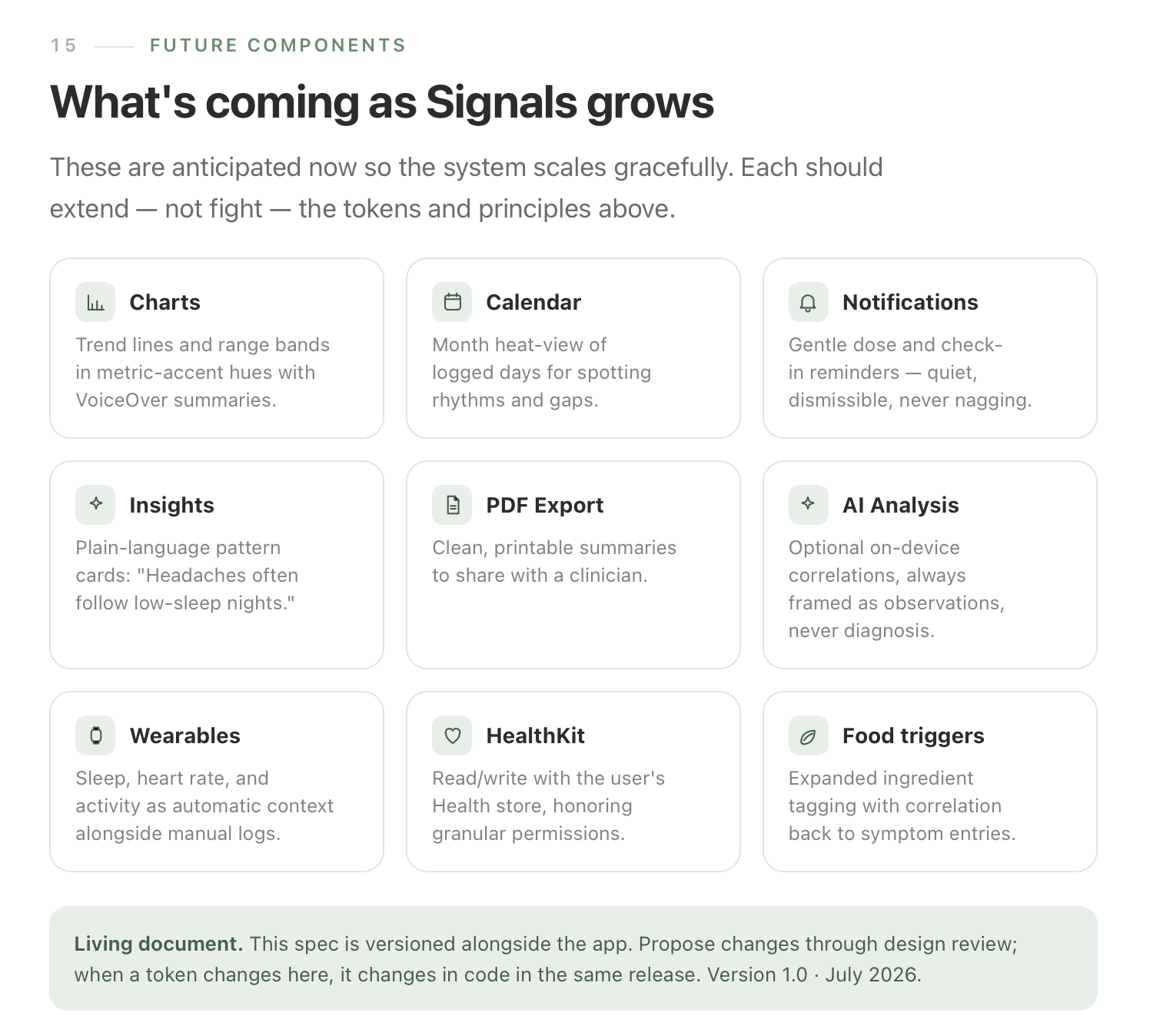
Everything you need. Nothing that nags.
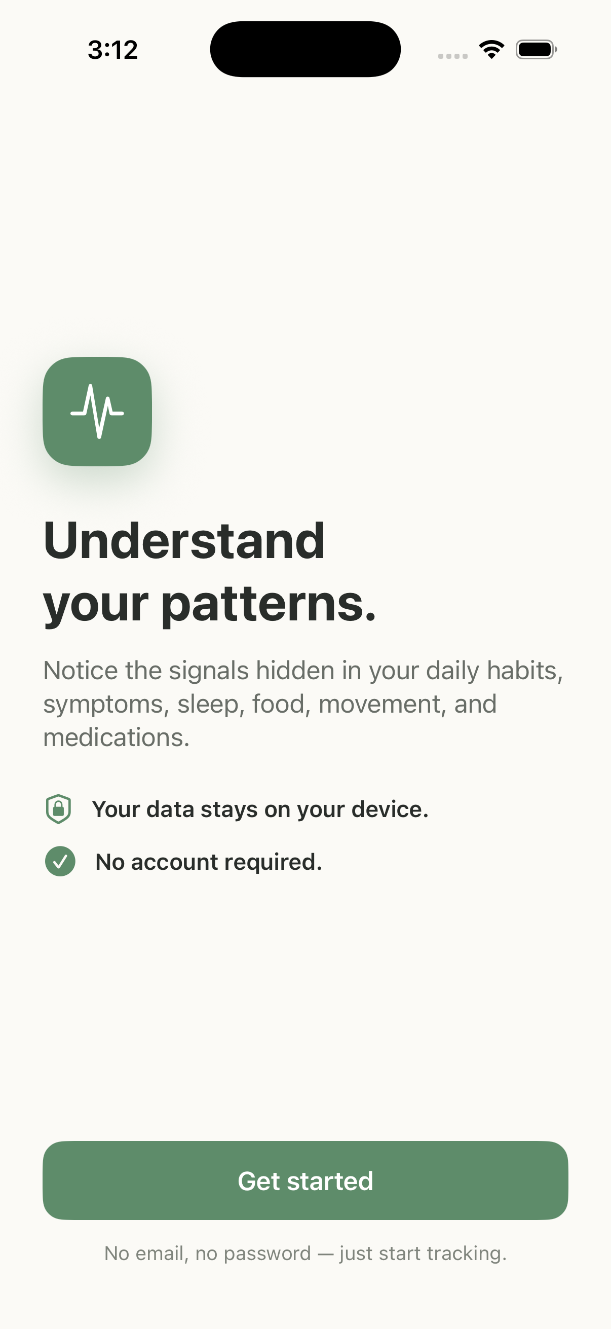
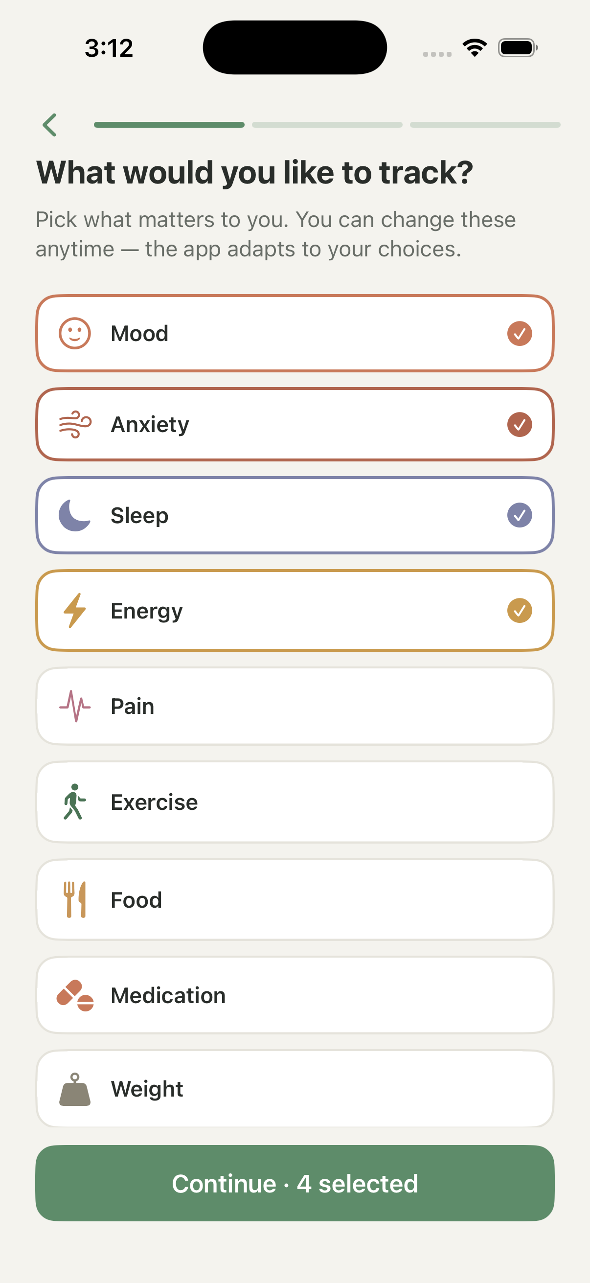
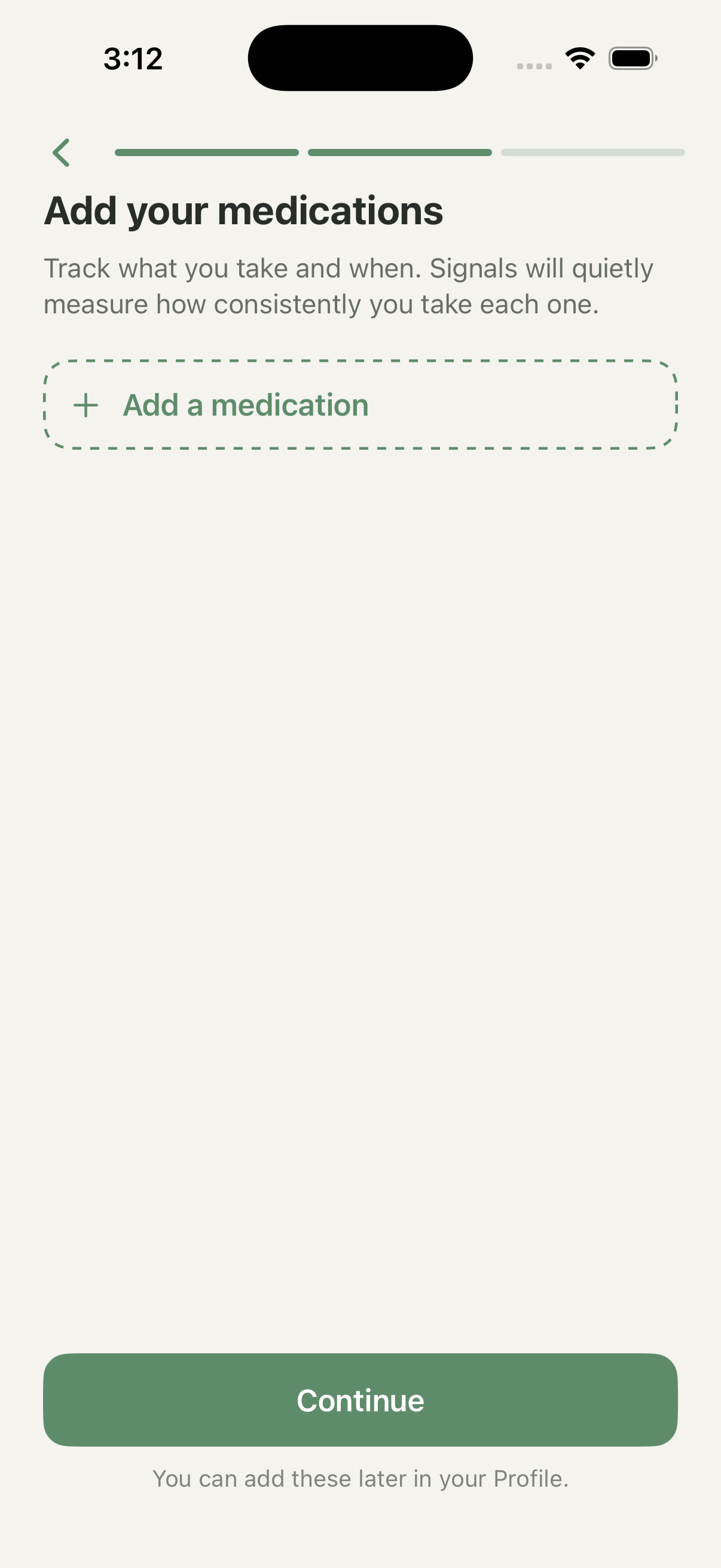
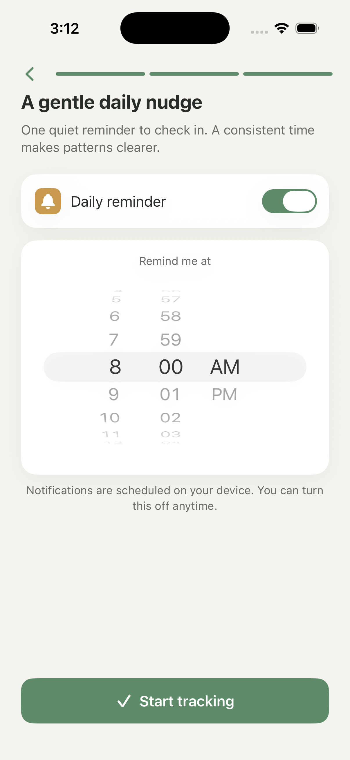
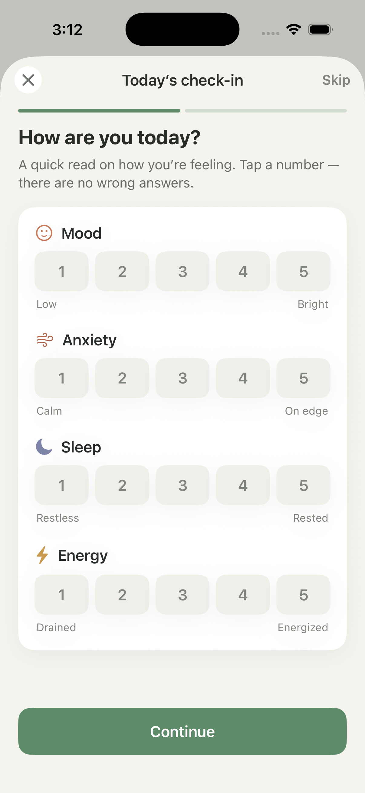
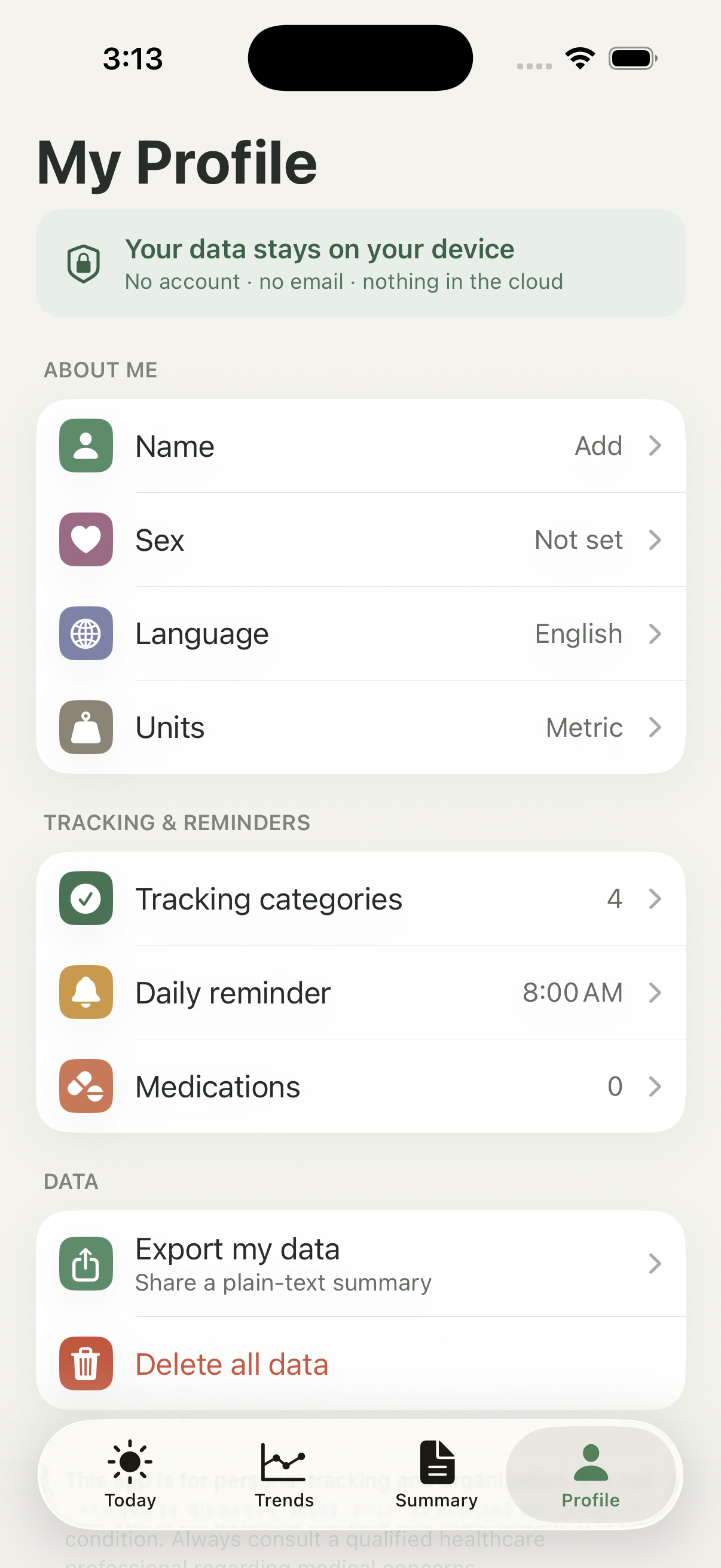
The hardest part of a health app isn't the data. It's the tone.
Every feature I removed made Signals better. The instinct in productivity and health tools is to add — more charts, more scores, more encouragement — but people tracking their own bodies are often already anxious, and each extra number is one more thing to feel behind on.
Balancing simplicity with flexibility meant letting people choose what to track without ever making the empty spaces feel like failure. Testing taught me that reassurance is a design decision — the calm is engineered, one omitted red badge at a time.
Help shape the second beta.
Signals is entering its second beta, and this is the part I care about most — living with it for a few weeks and telling me what feels right and what doesn't. It's less a product launch than an open invitation to build the calm version of this together.
Have an idea like this one?